How to celebrate a flawed hero
Celebration Picasso, La Collection prend des couleurs (Picasso Celebration: The Collection in a New Light), Musée Picasso Paris
Today’s topic: an exhibition I saw (twice and counting) at the Musée Picasso.
A couple years ago, I rushed from museum to museum for a celebration of Yves Saint Laurent, they were fantastic. For the past two years, I’ve been running from museum to museum for exhibitions commemorating the 150 and 100 anniversaries of Marcel Proust’s birth and death. And I thought, (silly me) that monumental multi-institutional celebrations would be over for a while. But I was wrong. Because here we are, in the thick of celebrating the 50th anniversary of Pablo Picassos death in 1973.
The anniversary of Picasso’s birth was less than 10 years after he died. I don’t remember the celebrations. But I do remember one significant event - the transfer of Picasso’s monumental anti-war painting ’Guernica’ from New York to Madrid. (Figure 1) The painting had been at MoMA for 42 years, since 1939. It was there on indefinite loan, as per Picasso's wishes, for as long as it took Spain to reestablish civil liberties. Picasso died in 1973. Two years later, Francisco Franco, Spain’s dictator finally died. Six years after that, the anniversary of Picasso’s birth, MoMA reluctantly agreed to send the painting to Madrid. And it’s still there, no longer at the Prado, but since 1991, in a room built especially for it at the Museo Reina Sofía.
Figure 1. Guernica, Picasso, 1937
The 50th anniversary of Picasso’s death is being celebrated at 50 cultural institutions throughout Europe and America under the auspices of the Musée national Picasso-Paris and the Museo Picasso in Malaga.
I’m no novice when it comes to Picasso exhibitions. I’ve seen them in Malaga and Barcelona; in Antibes, Vallauris and Paris; in San Francisco, Philadelphia and New York. I’ve seen exhibitions about his readymades, his ceramics, his (naughty) drawings, his Blue Period, his Cubism, his Bull Fighting, And of course, the impetus for and legacy of his Guernica. Oh wait, I’ve also seen exhibitions on Picasso and Ingres, Picasso and Valezquez and Picasso and Manet.
Nearly all of those exhibitions concentrated on Picasso the innovator, Picasso the creative genius. But Picasso the person, the cruel father and flagrant misogynist, was never very far from the surface and especially after he died and his children and grandchildren started telling stories and the ‘old boys’ of art history weren’t the only ones writing about Picasso. With the #me2 movement, the denunciations of Picasso’s sexual transgressions have only become more strident.
So, what’s a monographic museum like the Musée Picasso to do? The curators of the exhibition about Coco Chanel decided to tackle the problem of Chanel’s Nazi associations by saying they weren’t going to discuss it. And just like that, as easily as she avoided having her head shaved and being paraded nude through the streets of post war Paris, she just got away with it. Again.
That’s not what is happening with Picasso. The Musée Picasso Paris has been trying different strategies to keep itself relevant as a museum, to keep the complaints about Picasso the man from destroying the legacy of Picasso the artist. For example, different artists have been invited into the museum to enter into dialogue with Picasso, as for example Orlan about whom I wrote some months ago. (Figures 2, 3)
Figure 2. The Crying Women are Angry, Orlan, 2022
Figure 3. Weeping Woman (Dora Maar), Picasso, 1937
According to the museum’s director, the goal of the exhibitions to celebrate the 50th anniversary of the artist’s death will be “to look for new interpretations and approaches, to review the state of studies and understanding of Picasso’s work.” A Picasso Study Centre in Paris will open this autumn, to ‘lay the foundations for the Musée national Picasso-Paris of tomorrow.’
The exhibition that is currently at the Musée Picasso mostly doesn’t address any of the hard problems. The past isn’t important and the future doesn’t matter either. Let me explain. Two weeks ago I discussed an exhibition at the Musée Carnavalet, curated by the designer extraordinaire, Philippe Starck. It was a little confusing and a lot strange. And it seemed expensive (12 euros) for such a small exhibition in an otherwise free museum. Then last week I told you about a Kimono exhibition originally held at the V & A Museum in London. The exhibition designers had been tasked with transforming information and objects into a story that would engage museum goers.
This week’s exhibition is a bit of both. The Musée Picasso invited a designer to create an exhibition. The English fashion designer Sir Paul Smith’s (Figure 4) brief at the Picasso was less presumptuous and much more fun than Philippe Starck’s mandate had been. Smith was given the keys to the museum, its storage, its archives, its walls. He roamed freely, not looking for anything in particular but for anything that particularly struck his fancy. He found drawings and documents, prints and plates, paintings and posters, collages and sculptures. At the V & A Kimono exhibition, the designers helped the curators tell their story. At the Musée Picasso, the curators were tasked with providing the intellectual underpinning for what Sir Paul found interesting.
Figure 4. Sir PAUL SMITH at Musée Picasso, 2023
Smith is best known for his vibrant and colorful designs paired with impeccable tailoring. He’s the master of “classic with a twist.” (Figs. 5, 6) Giving Smith carte blanche to rehang the permanent collection to mark the 50th anniversary of Pablo Picasso’s death was either a mark of desperation or of genius. Turns out it was genius!
Figure 5. Paul Smith’s Los Angeles store
Figure 6. PAUL SMITH Boutique
In an interview Sir Paul explained what he had been asked to do. “The brief was … to show Picasso in a new light…It was meant to be a way to open the museum to a new generation and a new public. Not being an expert on Picasso, I could say, ‘I really like that’ without being burdened by all its history”.
In another interview, Smith explained it this way, “I am not an art historian at all. My approach is very spontaneous. I designed the exhibition on visual and intuitive associations”.
The exhibition probably should be entitled ‘Picasso through the eyes of Smith’. According to Smith,“The process was incredibly spontaneous, fast-paced, and instinctive…(I)t’s a sense of playfulness and joy that I wanted to impart with this project. That, after all, is how I’ve always approached art and design .… I hope it’s something that will be enjoyed by those familiar with Picasso’s work as much as those who have never seen it before. It really is the work in a new light.”
Smith first explored the museum’s holdings, which included poking through Picasso’s personal archive of some 200,000 objects, just before the pandemic. Just before travel restrictions made trips to Paris impossible. So, Sir Paul relied on photographs. When he finally saw the pieces he selected for the show, the size and scale of some of them surprised him. Anyone who has taken an art history class can relate to that. You see a slide of a painting and then, if you are lucky enough, you see the painting at a museum. It is never how you imagined it.
Smith’s genius was threefold - unexpected juxtapositions, surprising multiplications and COLOR. The museum’s rooms, normally white cubes, were transformed into a cacophony (symphony) of colors and patterns - floral wallpaper and vertical and horizontal stripes in blue, green and red, rooms in solid blue, rosy pink, blood red, verdant green. Smith admitted that even for him, “it was pretty scary.”
According to one critic, Smith’s intervention relies on three principles: the power of repeated patterns, the power of monochromes, and the power of Picasso’s motifs themselves. And then there is another treat - the catalogue of the exhibition is not only available in English, but Smith’s own delightful preparatory sketches are in it.
As I moved from one fabulous space to another, each one more joyful, more playful, more spectacular that the preceding one, I kept hearing the chorus from Handel’s Messiah. It was Glorious, it was Wonderful!
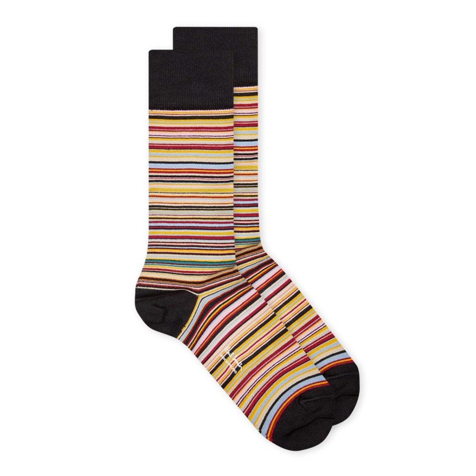
Let me just give you a taste of what it was like. The exhibition begins with Picasso’s famous Bull’s Head (1942) made from a bicycle handle bar and seat. On the opposite wall are many bicycle handlebars, many bicycle seats. Only one of which sticks out, the one with Paul Smith’s iconic striped socks stretched over it. (Figs. 7,8,9)
Figure 7. Bull’s head, bicycle handlebars & seat, Picasso, 1942
Figure 8. All wall of bicycle handlebars and seats, Picasso x Paul Smith, Musée Picasso
Figure 9. Pair of PAUL SMITH trademark striped socks
This salute is not only to Picasso’s ability to create something unexpected out of something ordinary but also to Sir Paul himself who planned to become a professional cyclist until he was hurt in an accident. To pass the months of forced convalescence, he began drawing and doodling and eventually designing. Just as Frida Kahlo had done during those months in bed after the accident that nearly killed her.
The next room is filled with covers of fashion magazines, mostly Vogue, the stars of which are those that Picasso doodled on and scribbled over. (Figs 10, 11)
Figure 10. Vogue Covers Room, Picasso x Paul Smith, Musée Picasso
Figure 11. Vogue Cover, detail with Picasso doodle, Picasso x Paul Smith, Musée Picasso
For the wall on which Picasso’s portrait of his son Paul as a Harlequin (1924) hangs, Smith repeats the diamond pattern in the colors of the boy’s costume. On the adjoining wall, another portrait, this of Paul as Pierrot, the pattern recalls the white puffs on the white costume. (Figure 12)
Figure 12. Left, Paul as a Harlequin, Right, Paul as Pierrot, Picasso, Picasso x Paul Smith, Musée Picasso
12.a. Harlequin Room
Picasso’s Blue Period paintings are in a room painted a deep navy blue. The room dedicated to one of Picasso’s passions - Bullfighting - is painted blood red.
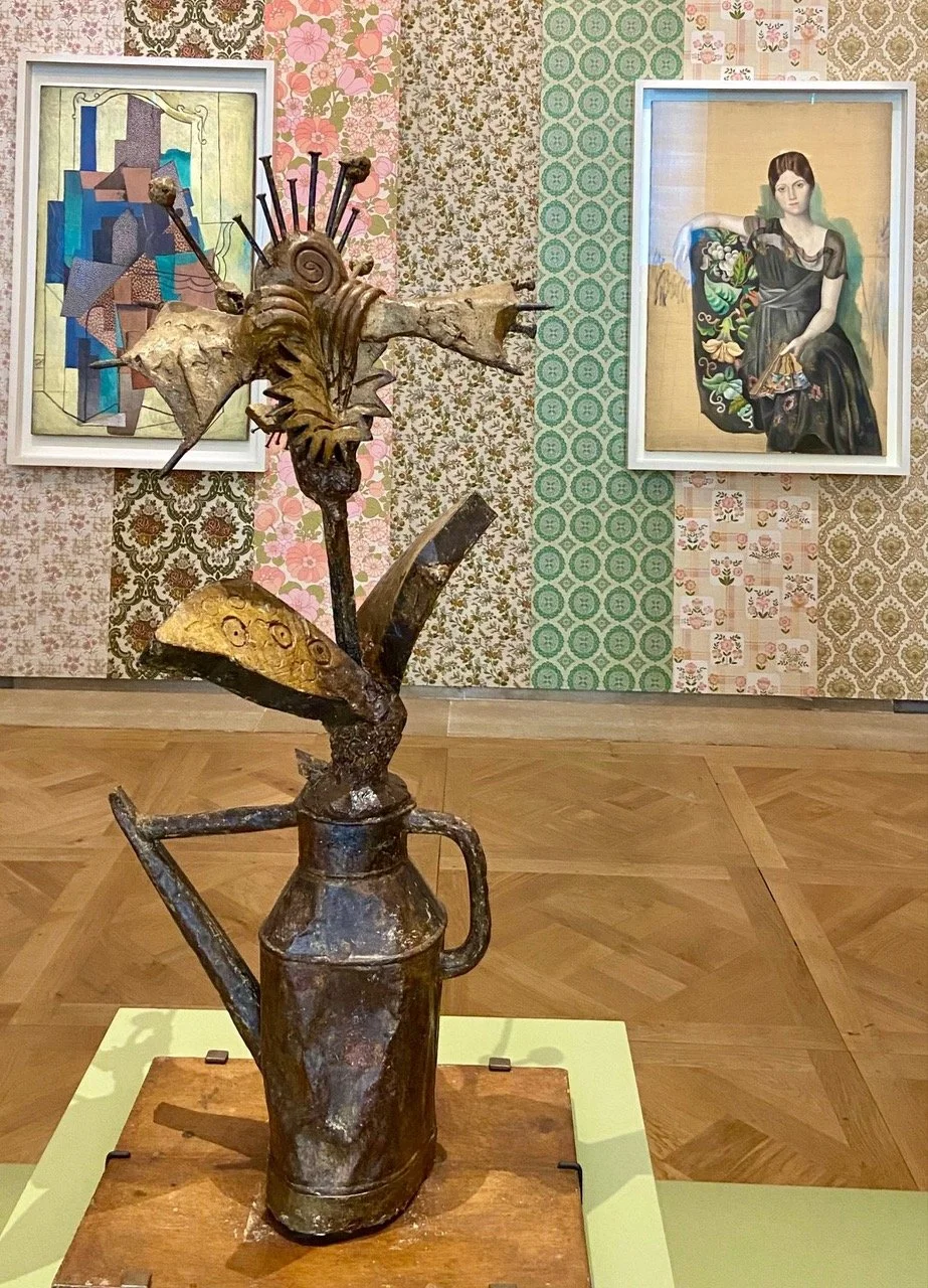
For Picasso’s collages and assemblages from the 1910s-1950s, Smith created his own collage from flowery vintage wallpapers. The jumble of colors and patterns plays well with Picasso’s own mixes and matches. (Figure 13)
Figure 13. Collages & Assemblages in wallpaper room, Picasso x Paul Smith, Musée Picasso
Figure 13a. Collages & Assemblages in wallpaper room, Picasso x Paul Smith, Musée Picasso
13b. Assemblages & Collages , Picasso x PAUL SMITH
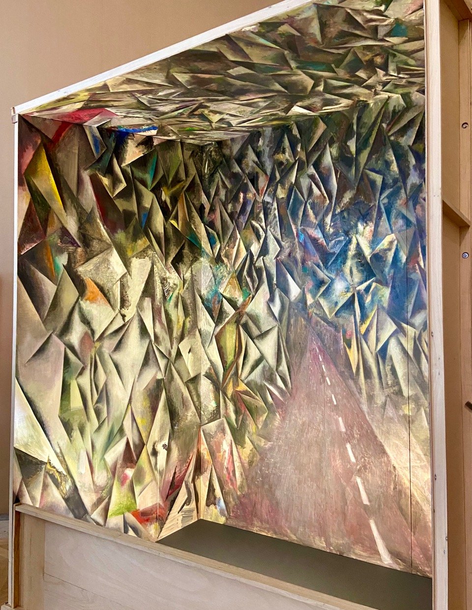
In the cubism room there is a landscape painting by Paul Cezanne which Picasso once owned by an artist Picasso once called ‘the father of us all’. And an eight-panel installation by Guillermo Kuitca, an Argentinian artist. It’s an open cube of a road that disappears into a cubist forest. (Figure 14) Kuitca described his painting this way, “You must stand in front of it, you are the fourth wall of the theatre…”
Figure 14. Road to Nowhere, Guillermo Kuitca, Picasso x Paul Smith, Musée Picasso
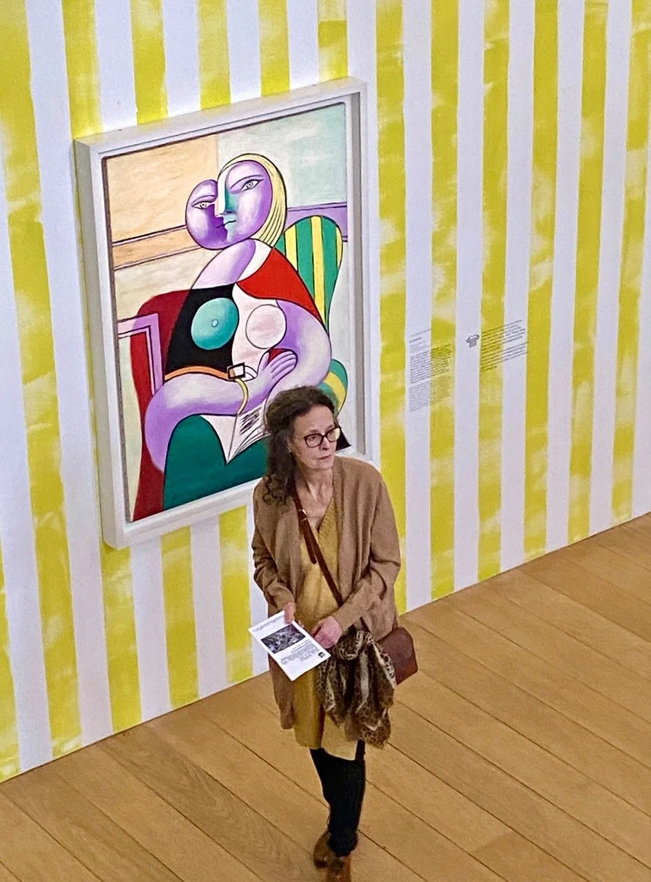
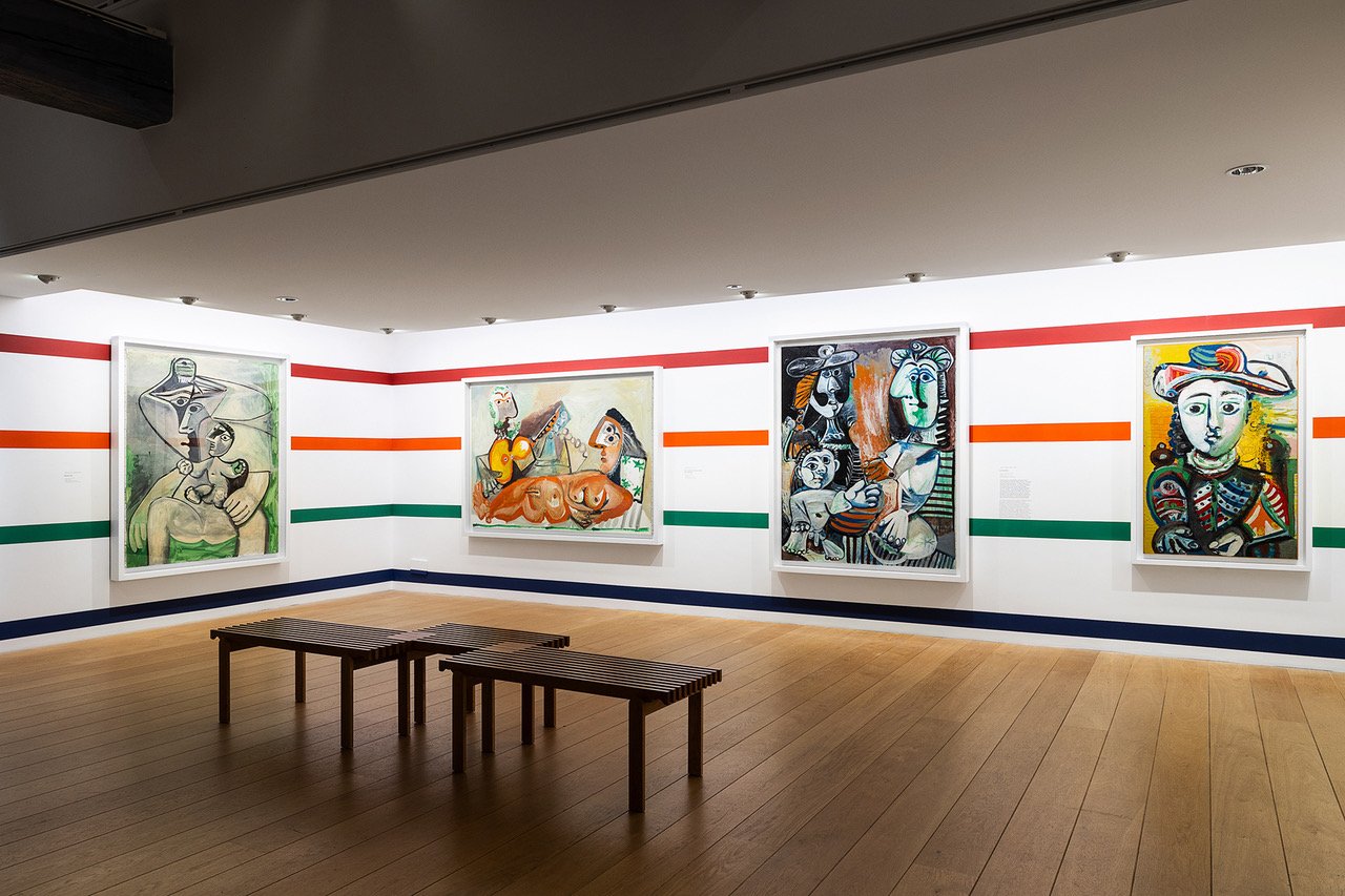
There are rooms of vertical stripes in candy color red, green and blue with portraits of people wearing clothes that have vertical stripes in red, green or blue. (Figs. 15, 16, 17)
Figure 15. Paintings by Picasso against hand painted blue and yellow striped walls, Picasso x Paul Smith, Musée Picasso
Figure 16. Painting by Picasso against a hand painted green striped wall, Picasso x Paul Smith, Musée Picasso
Figure 17. Painting by Picasso against a hand painted yellow striped wall, Picasso x Paul Smith, Musée Picasso
And another room painted with horizontal stripes is filled with paintings of people wearing horizontal striped clothes. (Figure 18)
Figure 18. Paintings by Picasso against hand painted horizontal striped walls, Picasso x Paul Smith, Musée Picasso
Who knew that Picasso was such a fan of stripes and used them in so many of his portraits. None of us did until Paul Smith pointed it out by not saying a word.
In a tiny room that often has surprising things, there is a recording of Gertrude Stein reciting one of her surprising poems, with text in English and French.
From one floor to the next, the grand ramp is covered with Smith’s own signature striped carpet. (Figure 19) Even on the back stairs, stripes on the cement and squiggles on the glass wall make the walk up fun. (Figs. 20, 21, 22)
Figure 19. Me on PAUL SMITH signature carpet, Picasso x Paul Smith, Musée Picasso
19.a. PAUL SMITH is definitely INTO STRIPES
19.b. THE rug
Figure 20. Red & Orange stripes on the back stairs, Picasso x Paul Smith, Musée Picasso
Figure 21. Little bunny face on back stairs, Picasso x Paul Smith, Musée Picasso
Figure 22. Little car on back stairs, Picasso x Paul Smith, Musée Picasso
The unique and the individual reappear on a wall of factory made, uniformly white plates. A few of Picasso’s richly colored ceramic plates offer a stark contrast. Ceramics was a skill Picasso learned late and quickly mastered. (Figs. 23, 24)
Figure 23. Walls of plates with Picasso plates, Picasso x Paul Smith, Musée Picasso
Figure 24. Wall of plates with Picasso plates, detail, Picasso x Paul Smith, Musée Picasso
And then in a room filled with paintings and collages and sculptures, that were all made when Picasso was in his 50s, the number ’50’ written everywhere - like a birthday card! (Figure 25)
Figure 25. A room celebrating stuff Picasso created when he was 50! Picasso x Paul Smith, Musée Picasso
Picasso’s series of riffs on Manet’s Déjeuner sur l’herbe (1863) are as well known as his various interpretations of Valezquez’s Les Meninas. Here both cut-outs and drawings of Manet’s infamous painting are set in a room painted in grass green. (Figs. 26, 27)
Figure 26. Picasso’s riffs on Manet’s Déjeuner sur l’herbe Picasso x Paul Smith, Musée Picasso
Figure 27. Picasso’s riff on Manet’s Déjeuner sur l’herbe Picasso x Paul Smith, Musée Picasso
In another room are photos and portraits of Picasso in his striped Breton shirt. He is drawing in one, having lunch in another. And in a third he is holding one of the Vogue covers that we saw in the beginning of the exhibition. (Figure 28) And hanging high above, in the rafters are dozens of those striped shirts. (Figure 29)
Figure 28. Photo of Picasso holding his Vogue magazine cover doodle (Fig. 11), Picasso x Paul Smith, Musée Picasso
Figure 29. Breton striped shirts in room of photos of Picasso wearing striped shirt, Picasso x Paul Smith, Musée Picasso
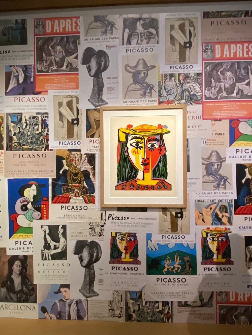
The next to the last room is plastered with posters from Picasso exhibitions over the years. Smith’s idea here was to show the posters as if they had been quickly glued onto the wall, wrinkles and puckers still showing. (Figure 30)
Figure 30. Room of posters of Picasso exhibitions
The final room is a self portrait as a young boy which Picasso painted the year before he died, an old man. It’s a skull confronting himself, confronting us. (Figure 31)
Figure 31. Self portrait, Picasso, 1971
The Musée Picasso-Paris has made efforts to confront the labels of sexist and misogynist that have plagued Picasso’s legacy for years. This exhibition, which commemorates the 50th anniversary of Picasso’s death, is a break from all that. By choosing Sir Paul Smith to rehang the collection, they have chosen to celebrate the vibrant, lively, colorful beauty of Picasso’s incredibly diverse artistic output. And the museum asks us to do the same. So, come to this museum to enjoy one creative’s homage to another. Stripes and all.
Copyright © 2023 Beverly Held, Ph.D. All rights reserved
Dear Reader, I hope you enjoyed reading this article. Please sign up below to receive more articles plus other original content from me, Dr. B. Merci!
And, if you enjoyed reading this review, please consider writing a comment. Thank you.


